
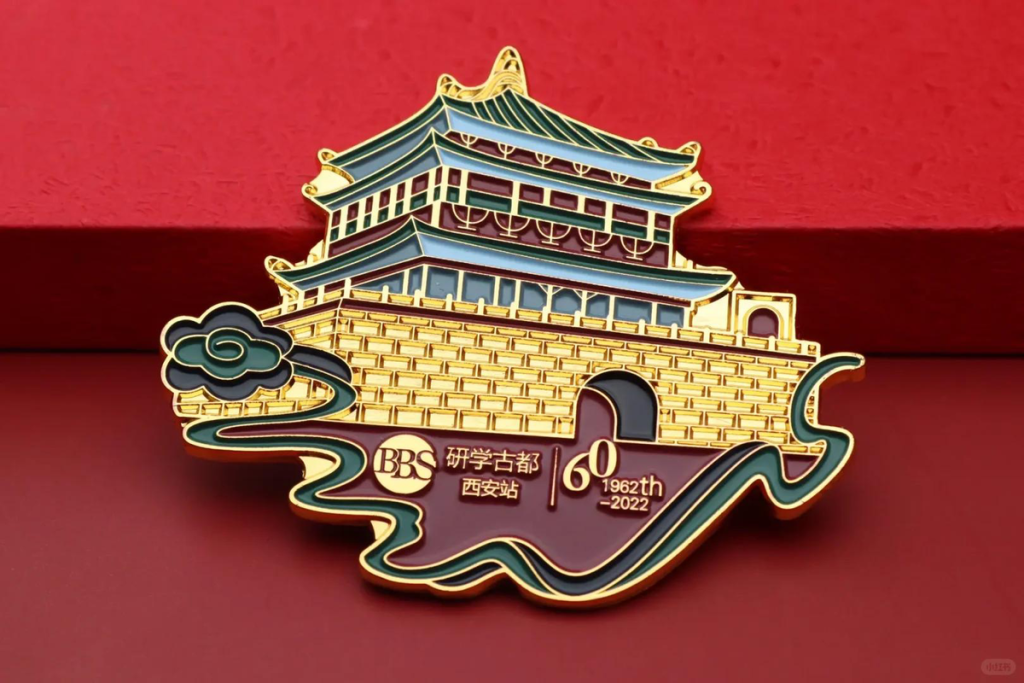
The finish should support the artwork, product use and target appearance. Soft enamel, hard enamel, printing and openwork are not interchangeable labels; each creates a different relationship between color, metal lines, surface level and fine detail.
Instead of selecting from a finish name alone, identify what the buyer needs to see and feel in the completed item. A clear reference for color, relief, shine and edge treatment makes the review more useful.
Soft enamel and visible relief
Soft enamel typically leaves the colored areas below the surrounding metal lines, creating a tactile surface with visible relief. It can suit artwork that benefits from distinct metal boundaries and a traditional pin or badge appearance.
Review the width of metal lines, the size of isolated color fields and the accessibility of recessed areas. The visual result depends on both the artwork and the selected plating or metal finish.
- Distinct metal outlines
- Recessed color areas
- Tactile relief
- Plating visible between colors
Hard enamel and a level surface
Hard enamel is used when a smoother, more level face is preferred. Colored areas and metal boundaries are finished together to create a different hand feel and reflection from recessed enamel.
The artwork still needs suitable separation between colors. Fine details that rely on shading, photographic transitions or extremely narrow lines may be better handled with another decoration method.
Printing for fine or continuous detail
UV or other printed decoration can be reviewed where the design contains fine graphics, tonal variation, gradients or details that are not practical as individual enamel fields. Printing may be applied to a suitable prepared surface or combined with relief and plating.
Confirm the printed area, underlying surface color, edge clearance and any protective treatment. A screen image should not be treated as a physical color guarantee; approved references and production samples remain important where appearance is critical.
- Fine text or illustration
- Multiple tones or gradients
- Printed detail combined with metal relief
- Surface and edge-clearance requirements
Openwork and cut-out detail
Openwork removes material to make negative space part of the design. It can reduce visual weight, create a lace-like outline or connect the item to a backing card or surface behind it. The remaining metal must still be strong enough for handling and attachment.
Small bridges, sharp internal corners and narrow unsupported areas require manufacturing review. Show which spaces must be fully open and which are simply recessed or colored so the drawing cannot be misread.
Coordinate plating and surface texture
Gold-tone, silver-tone, dark, antique or other metal appearances change the contrast of the same artwork. Polished areas reflect strongly, while matte, sand-textured or antique effects can make relief easier to read. The choice should be assessed with the product size and lighting in mind.
State whether the requirement applies to the whole item or only selected areas. Working edges, moving parts and hidden backs may need a different practical treatment from the decorative front.
Build a finish approval checklist
Before approving the finish, compare the production drawing and sample against the intended application. Check color boundaries, visible metal, surface level, open areas, edge quality, attachment and reverse side. Packaging should also protect polished or projecting details during transport.
For a coordinated collection, define which finish elements must remain consistent and which may change by product type. A shared plating direction can connect the range even when individual items use different decoration methods.
- Color references and boundaries
- Surface level and texture
- Plating direction
- Openwork and fine detail
- Protection during packing
Ready to Apply This?
Share the information you have and flag any decisions that still need technical input.